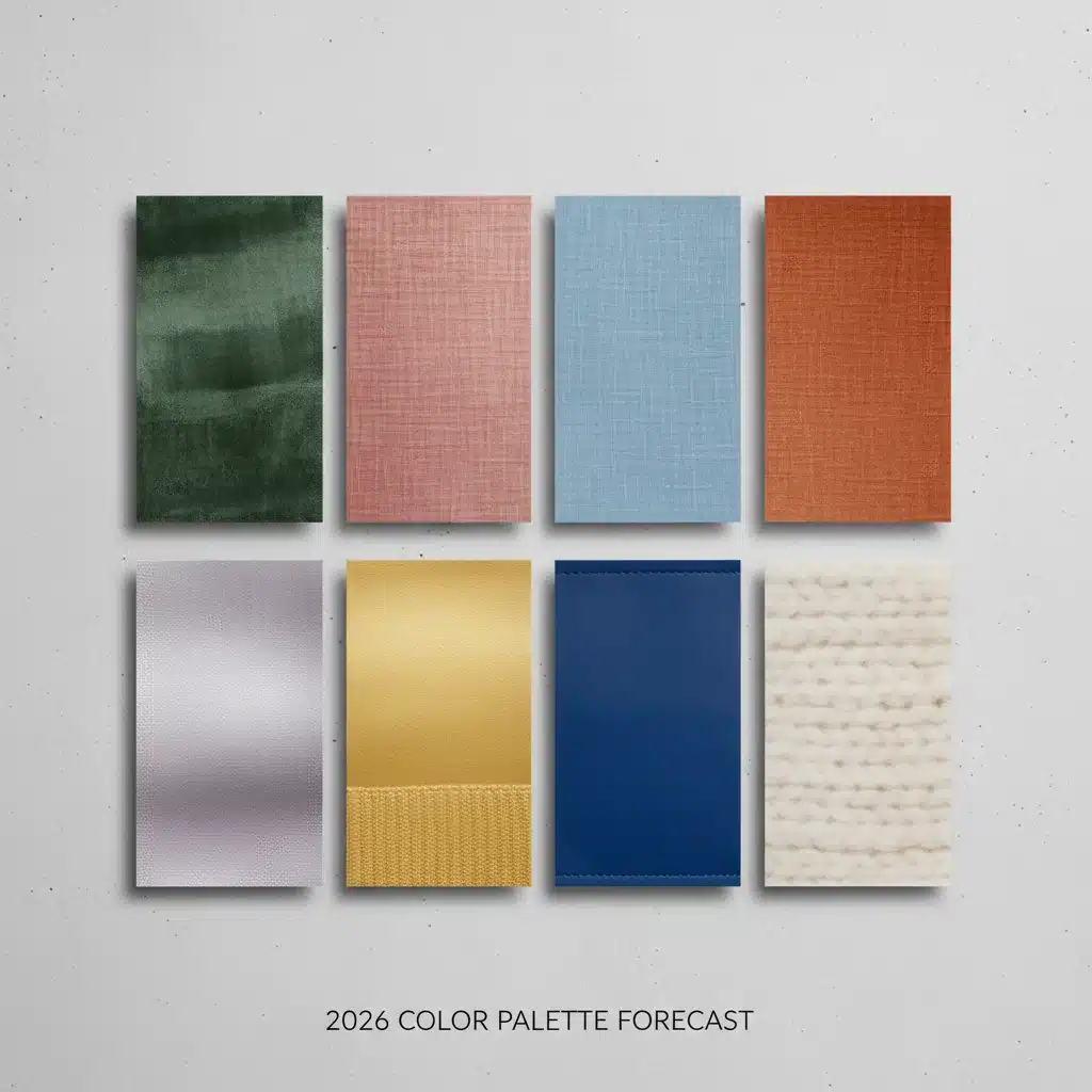
2026 Color Palette Forecast: 8 Hues That Will Define Fashion and Design This Year
As the world continues its rapid evolution, so too does our aesthetic sensibility. The year 2026 is poised to usher in a fresh wave of colors that will not only dictate fashion runways and interior design but also subtly influence our moods, perceptions, and purchasing decisions. Understanding the 2026 Color Forecast is not just about staying ahead of trends; it’s about anticipating the cultural zeitgeist and connecting with the collective unconscious.
Color forecasting is a fascinating blend of art and science, meticulously researched by experts who analyze global socio-economic shifts, technological advancements, environmental concerns, and emerging cultural narratives. These factors converge to shape the palettes that will resonate most deeply with consumers. For 2026, we anticipate a palette that balances optimism with realism, comfort with innovation, and nature with technology. Get ready to immerse yourself in the eight defining hues that will dominate the landscape of fashion and design.
The Art and Science Behind the 2026 Color Forecast
Before we dive into the specific shades, it’s crucial to understand the intricate process behind a 2026 Color Forecast. Color prediction isn’t merely a whimsical guess; it’s a sophisticated discipline. Trend forecasters, designers, and color institutes spend years observing macro and micro trends. They look at political climates, economic stability, global events, technological breakthroughs, and even shifts in art and pop culture. For instance, a renewed focus on sustainability might lead to a prevalence of earthy, natural tones, while advancements in AI could inspire futuristic, digital-inspired hues.
The psychological impact of color is also a significant consideration. Colors evoke emotions, influence behavior, and communicate messages without words. A vibrant, energetic hue might signal a period of optimism and growth, while softer, more muted tones could reflect a desire for calm and introspection. The 2026 Color Forecast is a reflection of where society is headed, offering a visual language for our collective aspirations and anxieties.
These forecasted colors then trickle down through various industries. Fashion designers incorporate them into their collections, interior designers use them to create inviting spaces, graphic designers leverage them in branding, and product developers apply them to everything from electronics to automobiles. The pervasive nature of these palettes means that by the time 2026 arrives, these colors will feel inherently ‘right’ and contemporary.
1. Verdant Echo: The Deep, Earthy Green
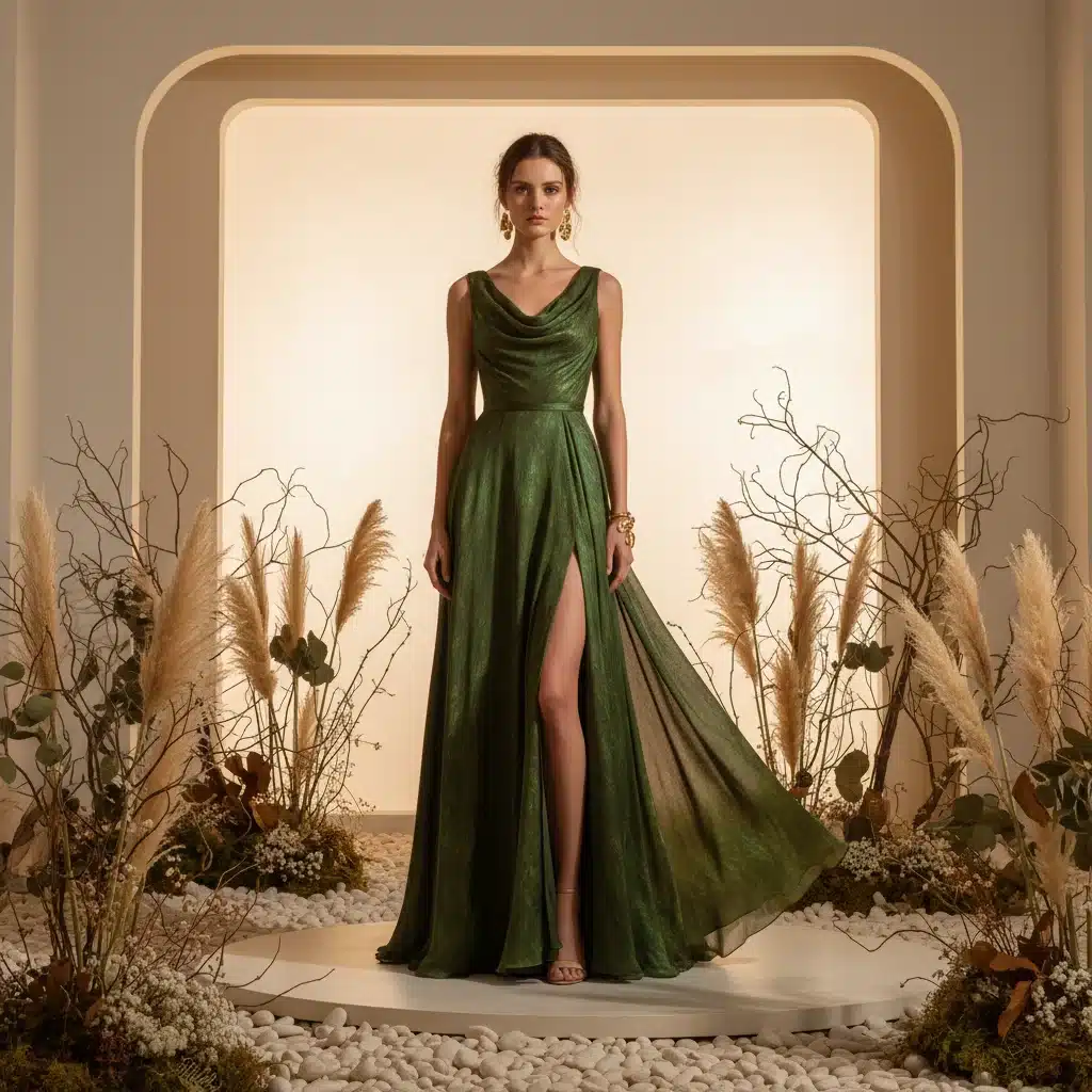
Leading our 2026 Color Forecast is Verdant Echo, a sophisticated, deep earthy green. This hue speaks to our increasing desire for reconnection with nature, sustainability, and a sense of grounding. It’s not a bright, energetic green, but rather a muted, rich shade reminiscent of ancient forests, moss-covered stones, and fertile soil. Verdant Echo embodies tranquility, stability, and a quiet strength.
In fashion, Verdant Echo will manifest in luxurious natural fibers like wool, linen, and organic cotton. Expect to see it in tailored outerwear, flowing dresses, and sophisticated accessories. Its versatility allows it to be both a statement color and a refined neutral. Paired with creams, browns, or even a touch of metallic gold, it exudes an understated elegance.
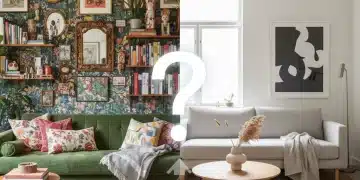
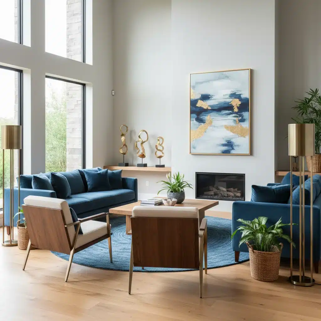
For interior design, Verdant Echo offers a calming backdrop. Imagine accent walls in this shade, plush velvet sofas, or ceramic tiles in bathrooms and kitchens. It pairs beautifully with natural wood tones, rattan, and brass hardware, creating spaces that feel both contemporary and timeless. This color will be pivotal in creating environments that promote well-being and a sense of escape from the digital overload.
2. Serene Horizon Blue: The Calming, Expansive Shade
Following closely in our 2026 Color Forecast is Serene Horizon Blue. This is a soft, airy blue, reminiscent of a clear sky at dawn or the distant horizon over a calm sea. It’s a color that evokes peace, clarity, and a sense of boundless possibility. In a world often characterized by chaos, Serene Horizon Blue offers a much-needed visual balm, promoting mental well-being and introspection.
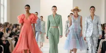
Fashion will embrace Serene Horizon Blue in lightweight, breathable fabrics such as silk, chiffon, and fine cotton. Think ethereal blouses, relaxed resort wear, and delicate evening gowns. It’s a color that can be worn head-to-toe for a monochromatic, calming effect, or used as a refreshing accent alongside deeper blues or crisp whites. It also works beautifully in athleisure wear, suggesting a sense of calm focus.
In home decor, Serene Horizon Blue will be a popular choice for bedrooms and bathrooms, creating sanctuaries of peace. It can also be introduced through textiles like throws, cushions, and curtains in living spaces. Its subtle nature makes it an excellent base color that allows other elements to shine, while still providing a distinct character to a room. This hue is about creating spaces that feel open, airy, and uncluttered.
3. Terra Cotta Bloom: The Warm, Grounded Orange-Red
Adding warmth and vibrancy to the 2026 Color Forecast is Terra Cotta Bloom. This shade is a rich, earthy orange-red, drawing inspiration from sun-baked clay, desert landscapes, and blooming desert flowers. It’s a color that is both grounded and energetic, symbolizing creativity, passion, and a connection to ancient artisanal traditions. Terra Cotta Bloom offers a sense of comfort and authenticity.
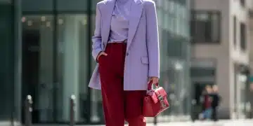
Fashion will see Terra Cotta Bloom in structured garments like blazers, wide-leg trousers, and statement knitwear. It’s a fantastic color for injecting personality into an outfit without being overly audacious. It pairs exceptionally well with other earthy tones, such as deep browns, creams, and even the aforementioned Verdant Echo. Accessories like leather bags and shoes in this hue will also be prominent, adding a touch of rustic luxury.
For interiors, Terra Cotta Bloom can be used to create inviting and cozy spaces. It’s perfect for adding warmth to a living room through upholstered furniture, rugs, or decorative pottery. It complements natural materials like wood, stone, and woven textures beautifully, creating a bohemian yet sophisticated aesthetic. This color encourages a feeling of belonging and handcrafted charm.
4. Digital Lavender: The Ethereal, Tech-Inspired Purple
Representing the intersection of nature and technology in our 2026 Color Forecast is Digital Lavender. This is a soft, almost translucent purple with a hint of grey, evoking feelings of calm, escapism, and digital innovation. It’s a color that feels both futuristic and soothing, reflecting our complex relationship with the digital world and our desire for moments of serenity within it.
In fashion, Digital Lavender will be seen in innovative fabrics with subtle sheens or translucent qualities. Think flowing dresses, tailored suits with a modern twist, and accessories that blend utility with whimsy. It’s a gender-fluid color that appeals to a younger demographic, often paired with metallics, whites, or even neon accents for a striking contrast. It embodies a playful yet sophisticated modernity.
For interior design, Digital Lavender can create surprisingly serene and sophisticated spaces. It works well in minimalist settings, perhaps as an accent wall in a home office or a creative studio. It can also be incorporated through lighting, art, or textiles to add a touch of futuristic calm. This color speaks to our longing for digital detox and mindful tech use, creating spaces that feel both current and contemplative.
5. Golden Ochre: The Rich, Radiant Yellow
Bringing a touch of optimistic warmth to the 2026 Color Forecast is Golden Ochre. This is a deep, rich yellow, more muted and sophisticated than a primary yellow, reminiscent of ancient pigments, sun-drenched landscapes, and artisanal craftsmanship. It signifies abundance, wisdom, and a quiet confidence, embodying a sense of enduring value and heritage.
Fashion will embrace Golden Ochre in luxurious fabrics like silk, cashmere, and fine wool. It will be a prominent color for statement pieces such as coats, structured dresses, and elegant knitwear. It pairs beautifully with deep blues, forest greens, and creams, creating a regal and opulent aesthetic. Accessories like scarves, handbags, and jewelry will also feature this radiant hue, adding a touch of understated glamour.
In interior design, Golden Ochre can infuse a room with warmth and personality. It’s excellent for accent chairs, plush rugs, or decorative throws. It works wonderfully in spaces that aim for a classic yet inviting feel, complementing dark wood furniture, antique pieces, and rich textures. This color encourages a sense of comfort, wisdom, and a connection to history, making a space feel lived-in and cherished.
6. Magnetic Gray: The Strong, Anchoring Neutral
Every vibrant palette needs a strong neutral, and for the 2026 Color Forecast, that role is filled by Magnetic Gray. This isn’t a dull, flat gray, but rather a deep, complex shade with subtle undertones, perhaps a hint of blue or green. It’s a color that signifies strength, stability, sophistication, and a quiet confidence. Magnetic Gray acts as an anchor, allowing other colors to truly pop while maintaining its own powerful presence.
In fashion, Magnetic Gray will be the new power neutral. Expect to see it in impeccably tailored suits, structured coats, and versatile separates. It’s a color that conveys professionalism and understated elegance, perfect for both corporate and casual settings. It pairs effortlessly with almost any other color in the palette, from Digital Lavender to Terra Cotta Bloom, providing a grounding effect.
For interior design, Magnetic Gray is an incredibly versatile base. It can be used on walls, flooring, or large furniture pieces to create a sophisticated and contemporary backdrop. It allows for bold accent colors to be introduced without overwhelming the space. This color speaks to a desire for order, clarity, and a refined aesthetic, creating environments that feel both modern and enduring.
7. Raspberry Ripple: The Playful, Energetic Pink
Injecting a dose of playful energy into the 2026 Color Forecast is Raspberry Ripple. This is a vibrant, yet not overly saccharine, shade of pink, reminiscent of ripe raspberries and joyful celebrations. It embodies optimism, creativity, and a fearless individuality. Raspberry Ripple is about breaking free from conventions and embracing a more expressive, spirited approach to color.
Fashion will see Raspberry Ripple in unexpected ways, moving beyond traditional feminine associations. Think sharp tailoring, sporty activewear, and bold statement accessories. It’s a color that demands attention and can be used to create memorable outfits. It pairs surprisingly well with Magnetic Gray for a sophisticated contrast, or with Serene Horizon Blue for a fresh, modern combination. This hue is all about making a joyful impact.
In interior design, Raspberry Ripple can be used as a powerful accent to invigorate a space. Imagine a single armchair in this vibrant hue, a piece of abstract art, or decorative pillows that pop against a neutral backdrop. It’s perfect for spaces that aim to inspire creativity and conversation, adding a touch of whimsy and personality. This color encourages boldness and a departure from the mundane.
8. Ethereal Pearl: The Luminous, Soft White
Completing our 2026 Color Forecast is Ethereal Pearl, a luminous and soft white with subtle warm undertones. This is not a stark, sterile white, but one that reflects light with a gentle glow, evoking feelings of purity, new beginnings, and refined simplicity. Ethereal Pearl acts as a sophisticated canvas, allowing other colors to shine while providing its own understated elegance.
In fashion, Ethereal Pearl will be paramount for creating effortlessly chic and timeless looks. Expect to see it in flowing fabrics like satin, chiffon, and luxurious knits. It’s perfect for elegant evening wear, crisp daywear, and minimalist ensembles. It pairs beautifully with any color in the palette, enhancing their vibrancy while maintaining a sense of serene sophistication. This color is about quiet luxury and enduring style.
For interior design, Ethereal Pearl is a foundational color that creates bright, airy, and expansive spaces. It’s ideal for walls, ceilings, and large furniture pieces, providing a sense of calm and clarity. It allows textures, natural light, and carefully chosen accent colors to take center stage. This hue promotes mindfulness, cleanliness, and a sense of fresh perspective, making any room feel more inviting and spacious.
How to Incorporate the 2026 Color Forecast into Your Life
Understanding the 2026 Color Forecast is one thing, but applying it is where the real fun begins. Here are some practical tips for integrating these defining hues into your wardrobe, home, and even your creative projects:
- Start Small with Accessories: If you’re hesitant to commit to a full outfit or a painted wall, begin with smaller items. A handbag in Terra Cotta Bloom, a scarf in Digital Lavender, or throw pillows in Verdant Echo can instantly update your look or space.
- Mix and Match Neutrals: Don’t underestimate the power of Magnetic Gray and Ethereal Pearl. These foundational colors can be paired with any of the more vibrant hues to create balanced and sophisticated ensembles or interior schemes.
- Embrace Monochromatic Looks: For a truly chic and cohesive aesthetic, consider dressing head-to-toe in one of the forecasted colors, like Serene Horizon Blue or Verdant Echo. This creates a powerful and elegant statement.
- Consider Texture: The way a color appears can be dramatically altered by texture. A glossy finish will make Raspberry Ripple pop, while a matte finish will give Verdant Echo a more organic feel. Experiment with different materials to achieve varied effects.
- Look for Complementary Colors: Refer back to the palette to find natural pairings. Golden Ochre with Serene Horizon Blue, or Terra Cotta Bloom with Magnetic Gray, can create dynamic and harmonious combinations.
- Personalize Your Palette: While these are the forecasted trends, remember that personal style is paramount. Pick the colors that resonate most with you and integrate them in a way that feels authentic.
- Seasonal Transitions: Think about how these colors can transition through the seasons. Raspberry Ripple might be vibrant in spring/summer, while Golden Ochre and Verdant Echo shine in autumn/winter.
- Digital Integration: For designers and content creators, consider using these colors in your branding, website design, and social media graphics to ensure your visual identity feels current and forward-thinking.
The Cultural Resonance of the 2026 Color Forecast
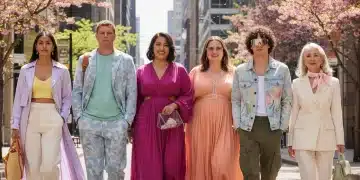
Beyond aesthetics, the 2026 Color Forecast speaks volumes about the collective human experience. The prominence of earthy greens and blues reflects a global yearning for environmental consciousness and mental well-being. The rise of Digital Lavender points to our intertwined relationship with technology and a search for digital tranquility. Warm hues like Terra Cotta Bloom and Golden Ochre suggest a desire for authenticity, craft, and optimistic resilience.
In a world that often feels divided, color can act as a unifying force, a shared language that transcends cultural barriers. The choices we make in color, both individually and collectively, are never arbitrary. They are deeply rooted in our aspirations, fears, and hopes for the future. The 2026 palette, therefore, is not just a collection of shades; it’s a reflection of our evolving values and a guide to the visual landscape of tomorrow.
As we move towards 2026, these eight colors will weave their way into the fabric of our lives, influencing everything from the clothes we wear to the products we buy and the spaces we inhabit. By understanding their nuances and implications, we can not only stay fashionable but also gain a deeper insight into the cultural currents shaping our world.
Conclusion: Embracing the Future with the 2026 Color Forecast
The 2026 Color Forecast presents a captivating array of hues, each with its own story and psychological resonance. From the grounding depth of Verdant Echo to the ethereal calm of Digital Lavender, and the vibrant energy of Raspberry Ripple to the sophisticated simplicity of Ethereal Pearl, these eight colors offer a rich tapestry for creativity and expression. They collectively paint a picture of a future that values balance, sustainability, innovation, and genuine connection.
Whether you’re a fashion enthusiast, an interior design professional, a graphic artist, or simply someone who appreciates the power of color, this forecast provides invaluable insight. It’s an invitation to experiment, to explore, and to embrace the visual language that will define the coming years. By incorporating these shades thoughtfully, you can ensure your personal style and living spaces remain current, impactful, and deeply resonant with the spirit of 2026.
So, as you look ahead, consider how these defining colors will shape your choices and inspire your creativity. The future is vibrant, and the 2026 palette is here to guide the way.